本文主要介绍了CSS3实现双圆角Tab菜单,文中通过示例代码介绍的非常详细,对大家的学习或者工作具有一定的参考学习价值,需要的朋友们下面随着小编来一起学习学习吧
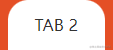
效果图

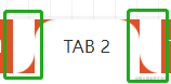
分析
一个带圆角的矩形 + 左右对称的不规则图形(一个小矩形分别去掉一个圆角),利用伪元素 ::before::after 和 box-shadow 阴影实现。


代码结构
TAB 1TAB 2TAB 3TAB 4
* { margin: 0; padding: 0; } .tab-box { display: flex; align-items: center; background: #e44f26; } .tab-box .tab-item { position: relative; flex: 1; height: 50px; line-height: 50px; text-align: center; color: #fff; background: #e44f26; } .tab-box .active { background: #fff; color: #333; z-index: 1; }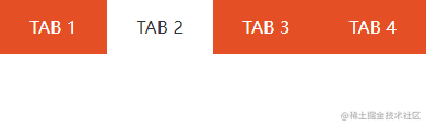
1. 顶部圆角实现
.tab-box .active { border-radius: 20px 20px 0 0; }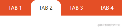
2. 底部外圆角实现(借助 CSS3 伪元素)
.tab-box .active::before { content: ""; position: absolute; left: -21px; bottom: 0; width: 21px; height: 50px; background: #e44f26; border-radius: 0 0 20px 0; } .tab-box .active::after { content: ""; position: absolute; right: -21px; bottom: 0; width: 21px; height: 50px; background: #e44f26; border-radius: 0 0 0 20px; }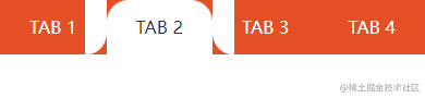
3. 使用 box-shadow 覆盖外圆角没有覆盖的区域
.tab-box .active { box-shadow: 20px 20px 0 0 blue, -20px 20px 0 0 blue; }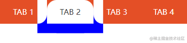
将蓝色改回白色,左右外圆角底色改成橙色
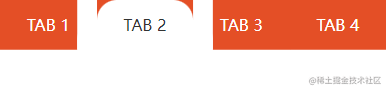
.tab-box .active::before { background: #e44f26; } .tab-box .active::after { background: #e44f26; }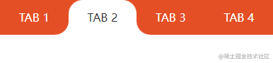
到此这篇关于CSS3实现双圆角Tab菜单的文章就介绍到这了,更多相关CSS3双圆角Tab菜单内容请搜索0133技术站以前的文章或继续浏览下面的相关文章,希望大家以后多多支持0133技术站!
以上就是CSS3实现双圆角Tab菜单的详细内容,更多请关注0133技术站其它相关文章!


