这篇文章主要介绍了一文汇总 CSS 两列布局和三列布局的具体使用,文中通过示例代码介绍的非常详细,对大家的学习或者工作具有一定的参考学习价值,需要的朋友们下面随着小编来一起学习学习吧
前言
随着大前端的发展,UI 框架层出不穷,让我们前端开发对 CSS 的能力要求变得没那么高或者没那么严苛,起码重要性是比不上 JS 编程的。但是,基础的 CSS 依然需要我们熟练掌握,今天就来总结写下 CSS 布局的方式。
两列布局
左列定宽,右列自适应
float + margin 布局
html 代码
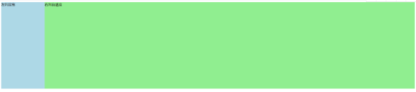
左列定宽右列自适应
css 代码:
#left { float: left; width: 200px; height: 400px; background-color: lightblue; } #right { margin-left: 200px; /* 大于或等于左列的宽度 */ height: 400px; background-color: lightgreen; } float + overflow 布局
html 代码
左列定宽右列自适应
css 代码
#left { float: left; width: 200px; height: 400px; background-color: lightblue; } #right { overflow: hidden; height: 400px; background-color: lightgreen; } 绝对定位布局
html 代码:
左列定宽右列自适应
css 代码:
#parent { position: relative; } #left { position: absolute; top: 0; left: 0; width: 200px; height: 400px; background-color: lightblue; } #right { position: absolute; top: 0; left: 200px; right: 0; height: 400px; background-color: lightgreen; } table 布局
html 代码:
左列定宽右列自适应
css 代码:
#parent { width: 100%; height: 400px; display: table; } #left, #right { display: table-cell; } #left { width: 200px; background-color: lightblue; } #right { background-color: lightgreen; } flex 布局
html 代码:
左列定宽右列自适应
css 代码:
#parent { width: 100%; height: 400px; display: flex; } #left { width: 200px; background-color: lightblue; } #right { flex: 1; background-color: lightgreen; }grid 网格布局
html 代码:
左列定宽右列自适应
css 代码:
#parent { width: 100%; height: 400px; display: grid; grid-template-columns: 200px auto; } #left { background-color: lightblue; } #right { background-color: lightgreen; } 左列不定宽,右列自适应
左列盒子宽度随着内容增加或减少发生变化,右列盒子自适应
float + overflow 布局
html 代码:
左列不定宽右列自适应
css 代码:
#left { float: left; height: 400px; background-color: lightblue; } #right { overflow: hidden; height: 400px; background-color: lightgreen; } flex 布局
html 代码:
左列不定宽右列自适应
css 代码:
#parent { display: flex; height: 400px; } #left { background-color: lightblue; } #right { flex: 1; background-color: lightgreen; } grid 布局
html 代码:
左列不定宽右列自适应
css 代码:
#parent { display: grid; grid-template-columns: auto 1fr; height: 400px; } #left { background-color: lightblue; } #right { background-color: lightgreen; } 三列布局
两列定宽,一列自适应
float + margin 布局
html 代码:
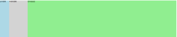
左列定宽中间列定宽右列自适应
css 代码:
#parent { height: 400px; } #left { float: left; width: 100px; height: 400px; background-color: lightblue; } #center { float: left; width: 200px; height: 400px; background-color: lightgrey; } #right { margin-left: 300px; /* 左列的宽度 + 中间列的宽度 */ height: 400px; background-color: lightgreen; } float + overflow 布局
html 代码:
左列定宽中间列定宽右列自适应
css 代码:
#parent { height: 400px; } #left { float: left; width: 100px; height: 400px; background-color: lightblue; } #center { float: left; width: 200px; height: 400px; background-color: lightgrey; } #right { overflow: hidden; height: 400px; background-color: lightgreen; }table 布局
html 代码:
左列定宽中间列定宽右列自适应
css 代码:
#parent { display: table; width: 100%; height: 400px; } #left { display: table-cell; width: 100px; background-color: lightblue; } #center { display: table-cell; width: 200px; background-color: lightgrey; } #right { display: table-cell; background-color: lightgreen; } flex 布局
html 代码:
左列定宽中间列定宽右列自适应
css 代码:
#parent { display: flex; width: 100%; height: 400px; } #left { width: 100px; background-color: lightblue; } #center { width: 200px; background-color: lightgrey; } #right { flex: 1; background-color: lightgreen; } grid 布局
html 代码
左列定宽中间列定宽右列自适应
css 代码
#parent { display: grid; grid-template-columns: 100px 200px auto; width: 100%; height: 400px; } #left { background-color: lightblue; } #center { background-color: lightgrey; } #right { background-color: lightgreen; } 左右定宽,中间自适应
圣杯布局和双飞翼布局目的都是希望先加载的是中间的部分,然后再开始加载 left 和 right 两部分相对来说不是很重要的东西。
圣杯布局
圣杯布局:为了让中间的内容不被遮挡,将中间 div(或最外层父 div)设置 padding-left 和 padding-right (值等于 left 和 right 的宽度),将左右两个 div 用相对布局 position: relative 并分别配合 left 和 right 属性,以便左右两栏 div 移动后不遮挡中间 div。
html 代码:
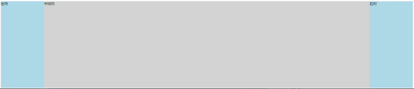
中间列左列右列
css 代码:
#parent { height: 400px; padding: 0 200px; overflow: hidden; } #left, #right { float: left; width: 200px; height: 100%; position: relative; background-color: lightblue; } #left { margin-left: -100%; /* 使 #left 上去一行 */ left: -200px; } #right { right: -200px; margin-left: -200px; /* 使 #right 上去一行 */ } #center { float: left; width: 100%; height: 100%; background-color: lightgrey; } 双飞翼布局
双飞翼布局,为了中间 div 内容不被遮挡,直接在中间 div 内部创建子 div 用于放置内容,在该子 div 里用 margin-left 和 margin-right 为左右两栏 div 留出位置。
html 代码:
中间列左列右列
css 代码:
#left, #right { float: left; width: 200px; height: 400px; background-color: lightblue; } #left { margin-left: -100%; /* 使 #left 上去一行 */ } #right { margin-left: -200px; /* 使 #right 上去一行 */ } #center { float: left; width: 100%; height: 400px; background-color: lightgrey; } #center-inside { height: 100%; margin: 0 200px; } flex 实现
html 代码:
中间列左列右列
css 代码:
#parent { display: flex; } #left, #right { flex: 0 0 200px; height: 400px; background-color: lightblue; } #left { order: -1; /* 让 #left 居于左侧 */ } #center { flex: 1; height: 400px; background-color: lightgrey; } 到此这篇关于一文汇总 CSS 两列布局和三列布局的具体使用的文章就介绍到这了,更多相关CSS 两列布局和三列布局内容请搜索html中文网以前的文章或继续浏览下面的相关文章,希望大家以后多多支持html中文网!
以上就是一文汇总 CSS 两列布局和三列布局的具体使用的详细内容,更多请关注0133技术站其它相关文章!


