本篇文章主要介绍了React根据宽度自适应高度的示例代码,小编觉得挺不错的,现在分享给大家,也给大家做个参考。一起跟随小编过来看看吧
有时对于响应式布局,我们需要根据组件的宽度自适应高度。CSS无法实现这种动态变化,传统是用jQuery实现。
而在React中无需依赖于JQuery,实现相对比较简单,只要在DidMount后更改width即可
需要注意的是在resize时候也要同步变更,需要注册个监听器
class Card extends React.Component { constructor(props) { super(props); this.state = { width: props.width || -1, height: props.height || -1, } } componentDidMount() { this.updateSize(); window.addEventListener('resize', () => this.updateSize()); } componentWillUnmount() { window.removeEventListener('resize', () => this.updateSize()); } updateSize() { try { const parentDom = ReactDOM.findDOMNode(this).parentNode; let { width, height } = this.props; //如果props没有指定height和width就自适应 if (!width) { width = parentDom.offsetWidth; } if (!height) { height = width * 0.38; } this.setState({ width, height }); } catch (ignore) { } } render() { return ( {`${this.state.width} x ${this.state.height}`} ); } } ReactDOM.render( 参考资料
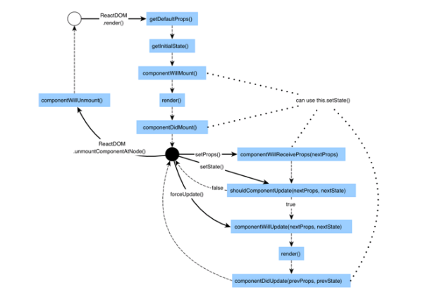
React生命周期
以上就是本文的全部内容,希望对大家的学习有所帮助,也希望大家多多支持html中文网。
以上就是React根据宽度自适应高度的示例代码的详细内容,更多请关注0133技术站其它相关文章!


