这篇文章主要介绍了利用模糊实现视觉3D效果实例,文中运用代码和图片讲解相关知识非常详细,感兴趣的小伙伴一起来看看吧
本文较短,将介绍巧用模糊实现视觉 3D 效果的技巧。
我们都知道,在正常的视觉效果中,离我们越近的通常我们会看的越清晰,而离我们较远则相对没那么清晰~
我们可以利用清晰与模糊两种状态来构建视差效果。像是这样:

而在 CSS 中,我们可以利用模糊滤镜 filter: blur() 与 transform-style: preserve-3d 来实现它们。
实现一个文字的 3D 变换
首先,我们需要实现一个文字的 3D 变换,这个比较简单。主要是借助 transform-style: preserve-3d 和 perspective,以及让文字绕 Y 轴进行旋转即可。
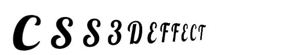
简单的代码如下:
CSS3DEFFECT
body { perspective: 160vmin; } p { font-size: 24vmin; transform-style: preserve-3d; animation: rotate 10s infinite ease-in-out; } @keyframes rotate { 0% { transform: rotateY(-45deg); } 50% { transform: rotateY(45deg); } 100% { transform: rotateY(-45deg); } }我们就可以得到这样一个 3D 文字效果:
实现文字的模糊
这个效果已经有了初步的 3D 效果,但是仅仅是这样,会觉得少了些什么。接下来我们就需要补充一下模糊的效果,让距离我们近的文字清晰,远离我们的文字模糊。
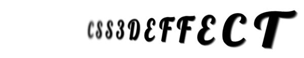
但这样就需要对每个文字进行精细化处理,上面的 HTML 结构无法做到对每一个文字的单独处理,我们简单改造一下结构:
CSS3DEFFECT
完整的代码大概是这样:
@import url('https://fonts.googleapis.com/css2?family=Lobster&display=swap'); $count: 12; body, html { font-family: 'Lobster', cursive; perspective: 160vmin; overflow: hidden; } p { margin: auto; font-size: 24vmin; transform-style: preserve-3d; animation: rotate 10s infinite ease-in-out; span { text-shadow: 1px 1px 0 rgba(0, 0, 0, .9), 2px 2px 0 rgba(0, 0, 0, .7), 3px 3px 0 rgba(0, 0, 0, .5), 4px 4px 0 rgba(0, 0, 0, .3), 5px 5px 0 rgba(0, 0, 0, .1); &:nth-child(-n+5) { animation-delay: -5s; } } } @for $i from 1 to 7 { span:nth-child(#{$i}), span:nth-last-child(#{$i}) { animation: filterBlur-#{$i} 10s infinite ease-in-out; } @keyframes filterBlur-#{$i} { 0% { filter: blur(0px) contrast(5); } 50% { filter: blur(#{7 - $i}px) contrast(1); } 100% { filter: blur(0px) contrast(5); } } } @keyframes rotate { 0% { transform: rotateY(-45deg); } 50% { transform: rotateY(45deg); } 100% { transform: rotateY(-45deg); } }简单解析下,这里有几个小技巧,仔细观察我们需要的效果:
1.第一个字符和最后一个字符在旋转的最左效果和最右效果下分别会离我们最近和最远,它们的效果其实应该是一致的,所以第一个字符和最后一个字符应该统一处理,依次类推,第二个字符和倒数第二字符统一处理,这里可以借助 SASS 利用 :nth-child 和 :nth-last-child 高效编写 CSS 代码
2.每次有一半是清晰的,一半的是模糊的,需要区分对待,利用 animation-delay 让一半的动画延迟一半进行
3.可以再配合 text-shadow 让文字更立体点
这样,我们可以最终得到如下效果:
完整的代码,你可以戳这里 -- CSS 灵感 -- 利用 filter:blur 增强文字的 3D 效果
使用模糊构建落叶效果
合理运用模糊,是能在没有 transform-style: preserve-3d 和 perspective 的加持下,也能构建出不错的 3D 效果。
之前在 Youtube 的一个视频教学网站看到了下面这个落叶效果,就是利用模糊以及简单的层级关系,让整个画面看上去非常的真实:
Falling Leaves
.leaf { position: absolute; width: 100%; height: 100%; top: 0; left: 0; } .leaf img { width: 75px; height: 75px; } .leaf div:nth-child(1) { left: 20%; animation: fall 22s linear infinite; animation-delay: -2s; } .leaf div:nth-child(2) { left: 70%; animation: fall 18s linear infinite; animation-delay: -4s; } .leaf div:nth-child(3) { left: 10%; animation: fall 21s linear infinite; animation-delay: -7s; } .leaf div:nth-child(4) { left: 50%; animation: fall 24s linear infinite; animation-delay: -5s; } .leaf div:nth-child(5) { left: 85%; animation: fall 19s linear infinite; animation-delay: -5s; } .leaf div:nth-child(6) { left: 15%; animation: fall 23s linear infinite; animation-delay: -10s; } .leaf div:nth-child(7) { left: 90%; animation: fall 20s linear infinite; animation-delay: -4s; } .leaf2 { transform: scale(1.6) translate(5%, -5%) rotate(15deg); filter: blur(1px); z-index: 10; } .leaf3 { filter: blur(2px); transform: scale(0.8) translate(-5%, 10%) rotate(170deg); } @keyframes fall { 0% { top: -30%; transform: translateX(20px) rotate(0deg); } 20% { transform: translateX(-20px) rotate(45deg); } 40% { transform: translateX(20px) rotate(90deg); } 60% { transform: translateX(-20px) rotate(135deg); } 80% { transform: translateX(20px) rotate(180deg); } 100% { top: 150%; transform: translateX(-20px) rotate(225deg); } }
主要就是通过清晰与模糊两种状态的对比,速度的差异,来构建视差效果。
CodePen Demo -- Falling leaves
以上就是利用模糊实现视觉3D效果实例讲解的详细内容,更多关于模糊实现视觉3D的资料请关注html中文网其它相关文章!
以上就是利用模糊实现视觉3D效果实例讲解的详细内容,更多请关注0133技术站其它相关文章!


