数据作图是数据分析的重要方法之一,R提供了丰富的作图函,下面这篇文章主要给大家介绍了关于R语言绘图基础教程的相关资料,文中通过实例代码以及图文介绍的非常详细,需要的朋友可以参考下
一、R语言绘图初阶
首先下载包,绘制一张图:
#install.packages(c("Hmisc", "RColorBrewer")) #install.packages(c("vcd", "plotrix", "sm", "vioplot")) library(ggplot2, lib.loc=""~/R/lib"") #生存一个可以修改的当前图形参数列表 par(ask=TRUE) opar <- par(no.readonly=TRUE) #载入数据集 attach(mtcars) # mtcars是R中自带的数据集,包含多种汽车的数据 plot(wt, mpg) abline(lm(mpg~wt)) #abline是画一条或多条直线,lm是线性模型 title("Regression of MPG on Weight") #不用了一定要detach detach(mtcars) 
1、图形参数
字体、颜色、坐标轴、标签等通过**函数par()**来指定选项。以这种方式设定的参数值除非被再次修改,否则将在
会话结束前一直有效。其调用格式为:
par(optionname=value,optionname=name,...)
不加参数地执行par()将生成一个含有当前图形参数设置的列表。添加参数no.readonly=TRUE可以生成一个可以修改的当前图形参数列表
例如一个药品的例子:
# Input data for drug example dose <- c(20, 30, 40, 45, 60) drugA <- c(16, 20, 27, 40, 60) drugB <- c(15, 18, 25, 31, 40) plot(dose, drugA, type="b") opar <- par(no.readonly=TRUE) #很重要

2、符号和线条


对上面的例子,现修改一些参数:
par(lty=2, pch=17) # change line type and symbol plot(dose, drugA, type="b") # generate a plot par(opar) # restore the original settings,恢复原设置 plot(dose, drugA, type="b", lty=3, lwd=3, pch=17, cex=2)


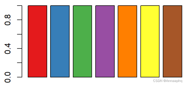
3、颜色

# choosing colors library(RColorBrewer) n <- 7 mycolors <- brewer.pal(n, "Set1") barplot(rep(1,n), col=mycolors)
n <- 10 mycolors <- rainbow(n) pie(rep(1, n), labels=mycolors, col=mycolors)

把饼图改成灰色:
mygrays <- gray(0:n/n) pie(rep(1, n), labels=mygrays, col=mygrays)

4、文本属性
# View font families opar <- par(no.readonly=TRUE) par(cex=1.5) plot(1:7,1:7,type="n") text(3,3,"Example of default text") text(4,4,family="mono","Example of mono-spaced text") text(5,5,family="serif","Example of serif text") par(opar)


仍用上方药物例子:
par(lwd=2, cex=1.5) par(cex.axis=.75, font.axis=3) plot(dose, drugA, type="b", pch=19, lty=2, col="red") plot(dose, drugB, type="b", pch=23, lty=6, col="blue", bg="green") par(opar)


5、图形尺寸与边界尺寸
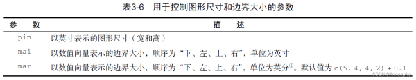
par(pin=c(2, 3))#图形大小
6、添加文本、自定义坐标轴和图例
可使用title()函数为图形添加标题和坐标轴标签,调用格式:
title(main="maintitle", sub="subtitle", xlab="x-axis label", ylab="y-axis label")
plot(dose, drugA, type="b", col="red", lty=2, pch=2, lwd=2, main="Clinical Trials for Drug A", sub="This is hypothetical data", xlab="Dosage", ylab="Drug Response", xlim=c(18, 60), ylim=c(0, 70)) #x轴刻度大小

你可以使用函数axis()来创建自定义的坐标轴,而非使用R中的默认坐标轴,其格式为:
axis(side, at=, labels=, pos=, lty=, col=, las=, tck=, ...) #例子在下面

函数**abline()**可以用来为图形添加参考线,其使用格式为:
dose <- c(20, 30, 40, 45, 60) drugA <- c(16, 20, 27, 40, 60) drugB <- c(15, 18, 25, 31, 40) opar <- par(no.readonly=TRUE) par(lwd=2, cex=1.5, font.lab=2) plot(dose, drugA, type="b", pch=15, lty=1, col="red", ylim=c(0, 60), main="Drug A vs. Drug B", xlab="Drug Dosage", ylab="Drug Response") lines(dose, drugB, type="b", pch=17, lty=2, col="blue") abline(h=c(30), lwd=1.5, lty=2, col="gray") abline(h=yvalues,v=xvalues)

我们可以使用**函数legend()**来添加图例,其使用格式为:
legend(location,title, legend, ...)
也可以这样理解:先绘制drugA的图,在这基础上加一天B的线,接下来添加图例:
library(Hmisc) minor.tick(nx=3, ny=3, tick.ratio=0.005) #自己加一些小的刻度线 legend("topleft", inset=.005, title="Drug Type", c("A","B"), lty=c(1, 2), pch=c(15, 17), col=c("red", "blue")) par(opar) 函数text()和mtext()将文本添加到图形上。 text()可向绘图区域内部添加文本,而mtext()则向图形的四个边界之一添加文本,使用格式分别为:
text(location, "text to place", pos, ...) mtext("text to place", side, line=n, ...) x <- c(1:10) y <- x z <- 10/x opar <- par(no.readonly=TRUE) # make a copy of current settings par(mar=c(5, 4, 4, 8) + 0.1) plot(x, y, type="b", pch=21, col="red", yaxt="n",lty=3, ann=FALSE) #yaxt指y轴类型,“n”指阻止y轴画出,ann指注释,此处为了下方自己添加,所以都去掉了 lines(x, z, type="b", pch=22, col="blue", lty=2) axis(2, at=x, labels=x, col.axis="red", las=2) #坐标轴另一种加法 axis(4, at=z, labels=round(z, digits=2), col.axis="blue", las=2, cex.axis=0.7, tck=-.01) mtext("y=1/x", side=4, line=3, cex.lab=1, las=2, col="blue") title("An Example of Creative Axes", xlab="X values", ylab="Y=X") par(opar) 
又如:
attach(mtcars) plot(wt, mpg, main="Mileage vs. Car Weight", xlab="Weight", ylab="Mileage", pch=18, col="blue") text(wt, mpg, row.names(mtcars), cex=0.6, pos=4, col="red") detach(mtcars)

7、图形的组合
par()函数中使用图形参数 mfrow=c(nrows, ncols) 来创建按行填充的、行数为nrows、列数为ncols的图形矩阵。另外,可以使用 mfcol=c(nrows, ncols) 按列填充矩阵
可以自己选择布局大小:
attach(mtcars) opar <- par(no.readonly=TRUE) par(mfrow=c(2,2)) plot(wt,mpg, main="Scatterplot of wt vs. mpg") plot(wt,disp, main="Scatterplot of wt vs. disp") hist(wt, main="Histogram of wt") boxplot(wt, main="Boxplot of wt") par(opar) detach(mtcars)

也可以尝试下三行一列:
attach(mtcars) opar <- par(no.readonly=TRUE) par(mfrow=c(3,1)) hist(wt) hist(mpg) hist(disp) par(opar) detach(mtcars)
填充矩阵:
attach(mtcars) layout(matrix(c(1,1,2,3), 2, 2, byrow = TRUE)) hist(wt) hist(mpg) hist(disp) detach(mtcars) attach(mtcars) layout(matrix(c(1, 1, 2, 3), 2, 2, byrow = TRUE), widths=c(3, 1), heights=c(1, 2)) hist(wt) hist(mpg) hist(disp) detach(mtcars)

还可以这样布局:
opar <- par(no.readonly=TRUE) par(fig=c(0, 0.8, 0, 0.8)) plot(mtcars$wt, mtcars$mpg, xlab="Miles Per Gallon", ylab="Car Weight") par(fig=c(0, 0.8, 0.55, 1), new=TRUE) boxplot(mtcars$wt, horizontal=TRUE, axes=FALSE) par(fig=c(0.65, 1, 0, 0.8), new=TRUE) boxplot(mtcars$mpg, axes=FALSE) mtext("Enhanced Scatterplot", side=3, outer=TRUE, line=-3) par(opar) 
二、R语言基本图形绘制
1、条形图
1.1 简单条形图
若height是一个向量,则它的值就确定了各条形的高度,并将绘制一幅垂直的条形图。使用选项horiz=TRUE则会生成一幅水平条形图。你也可以添加标注选项。选项main可添加一个图形标题,而选项xlab和ylab则会分别添加x轴和y轴标签
par(ask=TRUE) opar <- par(no.readonly=TRUE) # save original parameter settings library(vcd) counts <- table(Arthritis$Improved) #自带的 counts #大致查看一下数据前几行 head(Arthritis) barplot(counts, main="Simple Bar Plot", xlab="Improvement", ylab="Frequency") # 水平条形图 barplot(counts, main="Horizontal Bar Plot", xlab="Frequency", ylab="Improvement", horiz=TRUE)

1.2 堆砌条形图和分组条形图
如果height是一个矩阵而不是一个向量,则绘图结果将是一幅堆砌条形图或分组条形图。若beside=FALSE(默认值),则矩阵中的每一列都将生成图中的一个条形,各列中的值将给出堆砌的“子条”的高度。若beside=TRUE,则矩阵中的每一列都表示一个分组,各列中的值将并列而不是堆砌
堆砌条形图
library(vcd) counts <- table(Arthritis$Improved, Arthritis$Treatment) counts barplot(counts, main="Stacked Bar Plot", xlab="Treatment", ylab="Frequency", col=c("red", "yellow","green"), legend=rownames(counts)) #调整下图例大小:如果图例过大遮住图形,可以设置一下电脑的显示比例,调小 
分组条形图
barplot(counts, main="Grouped Bar Plot", xlab="Treatment", ylab="Frequency", col=c("red", "yellow", "green"), legend=rownames(counts), beside=TRUE) 
1.3 均值条形图
条形图并不一定要基于计数数据或频率数据。你可以使用数据整合函数并将结果传递给barplot()函数,来创建表示均值、中位数、标准差等的条形图
states <- data.frame(state.region, state.x77) #本身有的数据集 means <- aggregate(states$Illiteracy, by=list(state.region), FUN=mean) means means <- means[order(means$x),] means barplot(means$x, names.arg=means$Group.1) title("Mean Illiteracy Rate") 
1.4 条形图的微调
有若干种方式可以微调条形图的外观。例如,随着条数的增多,条形的标签可能会开始重叠。你可以使用参数cex.names来减小字号。将其指定为小于1的值可以缩小标签的大小。可选的参数names.arg允许你指定一个字符向量作为条形的标签名,你同样可以使用图形参数辅助调整文本间隔
# Listing 6.4 - Fitting labels in bar plots par(las=2) # set label text perpendicular to the axis par(mar=c(5,8,4,2)) # increase the y-axis margin counts <- table(Arthritis$Improved) # get the data for the bars # produce the graph barplot(counts, main="Treatment Outcome", horiz=TRUE, cex.names=0.8, names.arg=c("No Improvement", "Some Improvement", "Marked Improvement") ) par(opar) 
2、棘状图
是一种特殊的条形图,它称为棘状图(spinogram)。棘状图对堆砌条形图进行了重缩放,这样每个条形的高度均为1,每一段的高度即表示比例。棘状图可由vcd包中的函数 spine() 绘制
library(vcd) attach(Arthritis) counts <- table(Treatment,Improved) spine(counts, main="Spinogram Example") detach(Arthritis)

3、饼图
饼图可由以下函数创建: pie(x, labels),其中x是一个非负数值向量,表示每个扇形的面积,而labels则是表示各扇形标签的字符型向量
par(mfrow=c(2,2)) #画布的位置 slices <- c(10, 12, 4, 16, 8) #对应下方5个国家位置 lbls <- c("US", "UK", "Australia", "Germany", "France") pie(slices, labels = lbls, main="Simple Pie Chart") #更复杂一点 pct <- round(slices/sum(slices)*100) #算百分比比例 lbls <- paste(lbls, pct) lbls <- paste(lbls,"%",sep="") pie(slices,labels = lbls, col=rainbow(length(lbls)), main="Pie Chart with Percentages") #画立体饼图 library(plotrix) pie3D(slices, labels=lbls,explode=0.1, main="3D Pie Chart ") #设置explode立体效果 mytable <- table(state.region) lbls <- paste(names(mytable), "\n", mytable, sep="") pie(mytable, labels = lbls, main="Pie Chart from a dataframe\n (with sample sizes)") par(opar) 在医学中,饼图与扇形图用的都不多
下面列出扇形图:
library(plotrix) slices <- c(10, 12,4, 16, 8) lbls <- c("US", "UK", "Australia", "Germany", "France") fan.plot(slices, labels = lbls, main="Fan Plot") 4、直方图
直方图通过在x轴上将值域分割为一定数量的组,在y轴上显示相应值的频数,展示了连续型变量的分布。可以使用如下函数创建直方图: hist(x)
其中的x是一个由数据值组成的数值向量。参数 freq=FALSE 表示根据概率密度而不是频数绘制图形。参数breaks用于控制组的数量。在定义直方图中的单元时,默认将生成等距切分
hist(mtcars$mpg)
调整下间隔:
#频数分布直方图 hist(mtcars$mpg, breaks=12, col="red", xlab="Miles Per Gallon", main="Colored histogram with 12 bins") #密度直方图,根据概率密度绘图 hist(mtcars$mpg, freq=FALSE, breaks=12, col="red", xlab="Miles Per Gallon", main="Histogram, rug plot, density curve") rug(jitter(mtcars$mpg)) #添加对应的线 lines(density(mtcars$mpg), col="blue", lwd=2) #画一条曲线
我们往往希望加入正态分布曲线:
# histogram with superimposed normal curve (Thanks to Peter Dalgaard) x <- mtcars$mpg h<-hist(x, breaks=12, col="red", xlab="Miles Per Gallon", main="Histogram with normal curve and box") xfit<-seq(min(x),max(x),length=40) yfit<-dnorm(xfit,mean=mean(x),sd=sd(x)) yfit <- yfit*diff(h$mids[1:2])*length(x) lines(xfit, yfit, col="blue", lwd=2) box()
5、核密度图
用术语来说,核密度估计是用于估计随机变量概率密度函数的一种非参数方法。虽然其数学细节已经超出了本书
的范畴,但从总体上讲,核密度图不失为一种用来观察连续型变量分布的有效方法。绘制密度图的方法(不叠加到另一幅图上方)为: plot(density(x))
其中的x是一个数值型向量。由于plot()函数会创建一幅新的图形,所以要向一幅已经存在的图形上叠加一条密度曲线,可以使用lines()函数
使用sm包中的sm.density.compare()函数可向图形叠加两组或更多的核密度图,使用格式为:
sm.density.compare(x, factor)
d <- density(mtcars$mpg) # returns the density data plot(d) # plots the results d <- density(mtcars$mpg) plot(d, main="Kernel Density of Miles Per Gallon") polygon(d, col="red", border="blue") #填充颜色 rug(mtcars$mpg, col="brown")

par(lwd=2) library(sm) attach(mtcars) # create value labels cyl.f <- factor(cyl, levels= c(4, 6, 8), labels = c("4 cylinder", "6 cylinder", "8 cylinder")) #设置一个因子与它的水平 # plot densities sm.density.compare(mpg, cyl, xlab="Miles Per Gallon") title(main="MPG Distribution by Car Cylinders") #加图例 colfill<-c(2:(2+length(levels(cyl.f)))) cat("Use mouse to place legend...","\n\n") legend(locator(1), levels(cyl.f), fill=colfill) detach(mtcars) 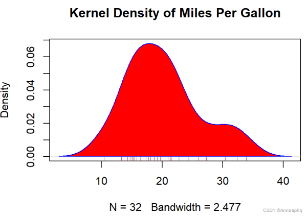
6、箱式图
箱线图(又称盒须图)通过绘制连续型变量的五数总括,即最小值、下四分位数(第25百分位数)、中位数(第50百分位数)、上四分位数(第75百分位数)以及最大值,描述了连续型变量的分布。箱线图能够显示出可能为离群点(范围±1.5*IQR以外的值, IQR表示四分位距,即上四分位数与下四分位数的差值)的观测,如:
boxplot(mtcars$mpg, main="Box plot", ylab="Miles per Gallon")
boxplot(mpg~cyl,data=mtcars, main="Car Milage Data", xlab="Number of Cylinders", ylab="Miles Per Gallon") # notched box plots凹槽箱式图 boxplot(mpg~cyl,data=mtcars, notch=TRUE, varwidth=TRUE, col="red", main="Car Mileage Data", xlab="Number of Cylinders", ylab="Miles Per Gallon")
7、使用并列箱线图进行跨组比较
箱线图可展示单个变量或分组变量。使用格式:
boxplot(formula,data=dataframe)
其中的formula是一个公式, dataframe代表提供数据的数据框(或列表)。一个示例公式为y ~A,这将为类别型变量A的每个值并列地生成数值型变量y的箱线图。公式y ~ A*B则将为类别型变量A和B所有水平的两两组合生成数值型变量y的箱线图
添加参数varwidth=TRUE 将使箱线图的宽度与其样本大小的平方根成正比。参数horizontal=TRUE可以反转坐标轴的方向
箱线图灵活多变,通过添加notch=TRUE,可以得到含凹槽的箱线图。若两个箱的凹槽互不重叠,则表明它们的中位数有显著差异
# Listing 6.9 - Box plots for two crossed factors # create a factor for number of cylinders mtcars$cyl.f <- factor(mtcars$cyl, levels=c(4,6,8), labels=c("4","6","8")) # create a factor for transmission type mtcars$am.f <- factor(mtcars$am, levels=c(0,1), labels=c("auto","standard")) # generate boxplot boxplot(mpg ~ am.f *cyl.f, data=mtcars, varwidth=TRUE, col=c("gold", "darkgreen"), main="MPG Distribution by Auto Type", xlab="Auto Type") 8、小提琴图
小提琴图是箱线图与核密度图的结合。你可以使用vioplot包中的vioplot()函数绘制它。请在第一次使用之前安装vioplot包,vioplot()函数的使用格式为:
vioplot(x1, x2, ... , names=, col=)
其中x1, x2, …表示要绘制的一个或多个数值向量(将为每个向量绘制一幅小提琴图)。参数names是小提琴图中标签的字符向量,而col是一个为每幅小提琴图指定颜色的向量
x1 <- mtcars$mpg[mtcars$cyl==4] #是一个向量,包含mpg与所有cy1为4的值 x2 <- mtcars$mpg[mtcars$cyl==6] x3 <- mtcars$mpg[mtcars$cyl==8] vioplot(x1, x2, x3, names=c("4 cyl", "6 cyl", "8 cyl"), col="gold") title("Violin Plots of Miles Per Gallon") 9、点图与散点图
点图提供了一种在简单水平刻度上绘制大量有标签值的方法。你可以使用dotchart()函数创建点图,格式为:
dotchart(x, labels=)
其中的x是一个数值向量,而labels则是由每个点的标签组成的向量。你可以通过添加参数groups来选定一个因子,用以指定x中元素的分组方式。如果这样做,则参数gcolor可以控制不同组标签的颜色, cex可以控制标签的大小
dotchart(mtcars$mpg,labels=row.names(mtcars),cex=.7, #每加仑跑的里程 main="Gas Mileage for Car Models", xlab="Miles Per Gallon")
x <- mtcars[order(mtcars$mpg),] x$cyl <- factor(x$cyl) x$color[x$cyl==4] <- "red" x$color[x$cyl==6] <- "blue" x$color[x$cyl==8] <- "darkgreen" dotchart(x$mpg, labels = row.names(x), cex=.7, pch=19, groups = x$cyl, gcolor = "black", color = x$color, main = "Gas Mileage for Car Models\ngrouped by cylinder", xlab = "Miles Per Gallon")
R中创建散点图的基础函数是plot(x, y),其中, x和y是数值型向量,代表着图形的(x, y)点
# install.packages(c("car", "scatterplot3d", "gclus", "hexbin", "IDPmisc", "Hmisc", # # "corrgram", "vcd", "rld")) par(ask=TRUE) opar <- par(no.readonly=TRUE) # record current settings # Listing 11.1 - A scatter plot with best fit lines attach(mtcars) plot(wt, mpg, main="Basic Scatterplot of MPG vs. Weight", xlab="Car Weight (lbs/1000)", ylab="Miles Per Gallon ", pch=19) abline(lm(mpg ~ wt), col="red", lwd=2, lty=1) lines(lowess(wt, mpg), col="blue", lwd=2, lty=2) detach(mtcars) 
10、折线图
如果将散点图上的点从左往右连接起来,就会得到一个折线图。以基础安装中的Orange数据集为例,它包含五种橘树的树龄和年轮数据
library(car) scatterplot(mpg ~ wt | cyl, data=mtcars, lwd=2, main="Scatter Plot of MPG vs. Weight by # Cylinders", xlab="Weight of Car (lbs/1000)", ylab="Miles Per Gallon", id.method="identify", legend.plot=TRUE, labels=row.names(mtcars), boxplots="xy") # Listing 11.2 - Creating side by side scatter and line plots opar <- par(no.readonly=TRUE) par(mfrow=c(1,2)) #设置画布,一行两列 t1 <- subset(Orange, Tree==1) #自带的数据集 plot(t1$age, t1$circumference, xlab="Age (days)", ylab="Circumference (mm)", main="Orange Tree 1 Growth") plot(t1$age, t1$circumference, xlab="Age (days)", ylab="Circumference (mm)", main="Orange Tree 1 Growth", type="b") par(opar)
t | cyl, data=mtcars, lwd=2,
main=“Scatter Plot of MPG vs. Weight by # Cylinders”,
xlab=“Weight of Car (lbs/1000)”,
ylab=“Miles Per Gallon”, id.method=“identify”,
legend.plot=TRUE, labels=row.names(mtcars),
boxplots=“xy”)
Listing 11.2 - Creating side by side scatter and line plots
opar <- par(no.readonly=TRUE)
par(mfrow=c(1,2)) #设置画布,一行两列
t1 <- subset(Orange, Tree==1) #自带的数据集
plot(t1 a g e , t 1 age, t1 age,t1circumference,
xlab=“Age (days)”,
ylab=“Circumference (mm)”,
main=“Orange Tree 1 Growth”)
plot(t1 a g e , t 1 age, t1 age,t1circumference,
xlab=“Age (days)”,
ylab=“Circumference (mm)”,
main=“Orange Tree 1 Growth”,
type=“b”)
par(opar)

总结
到此这篇关于R语言绘图基础教程的文章就介绍到这了,更多相关R语言绘图教程内容请搜索0133技术站以前的文章或继续浏览下面的相关文章希望大家以后多多支持0133技术站!
以上就是R语言绘图基础教程(新手入门推荐!)的详细内容,更多请关注0133技术站其它相关文章!


