通常我们用 Python 绘制的都是二维平面图,但有时也需要绘制三维场景图,下面这篇文章主要给大家介绍了关于python绘制三维图的相关资料,文中通过图文介绍的非常详细,需要的朋友可以参考下
本文仅仅梳理最基本的绘图方法。
一、初始化
假设已经安装了matplotlib工具包。
利用matplotlib.figure.Figure创建一个图框:
import matplotlib.pyplot as plt from mpl_toolkits.mplot3d import Axes3D fig = plt.figure() ax = fig.add_subplot(111, projection='3d')

二、直线绘制(Line plots)
基本用法:
ax.plot(x,y,z,label=' ')
code:
import matplotlib as mpl from mpl_toolkits.mplot3d import Axes3D import numpy as np import matplotlib.pyplot as plt mpl.rcParams['legend.fontsize'] = 10 fig = plt.figure() ax = fig.gca(projection='3d') theta = np.linspace(-4 * np.pi, 4 * np.pi, 100) z = np.linspace(-2, 2, 100) r = z**2 + 1 x = r * np.sin(theta) y = r * np.cos(theta) ax.plot(x, y, z, label='parametric curve') ax.legend() plt.show()

三、散点绘制(Scatter plots)
基本用法:
ax.scatter(xs, ys, zs, s=20, c=None, depthshade=True, *args, *kwargs)
- xs,ys,zs:输入数据;
- s:scatter点的尺寸
- c:颜色,如c = 'r'就是红色;
- depthshase:透明化,True为透明,默认为True,False为不透明
- *args等为扩展变量,如maker = 'o',则scatter结果为’o‘的形状
code:
from mpl_toolkits.mplot3d import Axes3D import matplotlib.pyplot as plt import numpy as np def randrange(n, vmin, vmax): ''' Helper function to make an array of random numbers having shape (n, ) with each number distributed Uniform(vmin, vmax). ''' return (vmax - vmin)*np.random.rand(n) + vmin fig = plt.figure() ax = fig.add_subplot(111, projection='3d') n = 100 # For each set of style and range settings, plot n random points in the box # defined by x in [23, 32], y in [0, 100], z in [zlow, zhigh]. for c, m, zlow, zhigh in [('r', 'o', -50, -25), ('b', '^', -30, -5)]: xs = randrange(n, 23, 32) ys = randrange(n, 0, 100) zs = randrange(n, zlow, zhigh) ax.scatter(xs, ys, zs, c=c, marker=m) ax.set_xlabel('X Label') ax.set_ylabel('Y Label') ax.set_zlabel('Z Label') plt.show()
四、线框图(Wireframe plots)
基本用法:
ax.plot_wireframe(X, Y, Z, *args, **kwargs)
- X,Y,Z:输入数据
- rstride:行步长
- cstride:列步长
- rcount:行数上限
- ccount:列数上限
code:
from mpl_toolkits.mplot3d import axes3d import matplotlib.pyplot as plt fig = plt.figure() ax = fig.add_subplot(111, projection='3d') # Grab some test data. X, Y, Z = axes3d.get_test_data(0.05) # Plot a basic wireframe. ax.plot_wireframe(X, Y, Z, rstride=10, cstride=10) plt.show()

五、表面图(Surface plots)
基本用法:
ax.plot_surface(X, Y, Z, *args, **kwargs)
- X,Y,Z:数据
- rstride、cstride、rcount、ccount:同Wireframe plots定义
- color:表面颜色
- cmap:图层
code:
from mpl_toolkits.mplot3d import Axes3D import matplotlib.pyplot as plt from matplotlib import cm from matplotlib.ticker import LinearLocator, FormatStrFormatter import numpy as np fig = plt.figure() ax = fig.gca(projection='3d') # Make data. X = np.arange(-5, 5, 0.25) Y = np.arange(-5, 5, 0.25) X, Y = np.meshgrid(X, Y) R = np.sqrt(X**2 + Y**2) Z = np.sin(R) # Plot the surface. surf = ax.plot_surface(X, Y, Z, cmap=cm.coolwarm, linewidth=0, antialiased=False) # Customize the z axis. ax.set_zlim(-1.01, 1.01) ax.zaxis.set_major_locator(LinearLocator(10)) ax.zaxis.set_major_formatter(FormatStrFormatter('%.02f')) # Add a color bar which maps values to colors. fig.colorbar(surf, shrink=0.5, aspect=5) plt.show()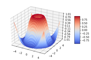
六、三角表面图(Tri-Surface plots)
基本用法:
ax.plot_trisurf(*args, **kwargs)
- X,Y,Z:数据
- 其他参数类似surface-plot
code:
from mpl_toolkits.mplot3d import Axes3D import matplotlib.pyplot as plt import numpy as np n_radii = 8 n_angles = 36 # Make radii and angles spaces (radius r=0 omitted to eliminate duplication). radii = np.linspace(0.125, 1.0, n_radii) angles = np.linspace(0, 2*np.pi, n_angles, endpoint=False) # Repeat all angles for each radius. angles = np.repeat(angles[..., np.newaxis], n_radii, axis=1) # Convert polar (radii, angles) coords to cartesian (x, y) coords. # (0, 0) is manually added at this stage, so there will be no duplicate # points in the (x, y) plane. x = np.append(0, (radii*np.cos(angles)).flatten()) y = np.append(0, (radii*np.sin(angles)).flatten()) # Compute z to make the pringle surface. z = np.sin(-x*y) fig = plt.figure() ax = fig.gca(projection='3d') ax.plot_trisurf(x, y, z, linewidth=0.2, antialiased=True) plt.show()

七、等高线(Contour plots)
基本用法:
ax.contour(X, Y, Z, *args, **kwargs)
code:
from mpl_toolkits.mplot3d import axes3d import matplotlib.pyplot as plt from matplotlib import cm fig = plt.figure() ax = fig.add_subplot(111, projection='3d') X, Y, Z = axes3d.get_test_data(0.05) cset = ax.contour(X, Y, Z, cmap=cm.coolwarm) ax.clabel(cset, fontsize=9, inline=1) plt.show()

二维的等高线,同样可以配合三维表面图一起绘制:
code:
from mpl_toolkits.mplot3d import axes3d from mpl_toolkits.mplot3d import axes3d import matplotlib.pyplot as plt from matplotlib import cm fig = plt.figure() ax = fig.gca(projection='3d') X, Y, Z = axes3d.get_test_data(0.05) ax.plot_surface(X, Y, Z, rstride=8, cstride=8, alpha=0.3) cset = ax.contour(X, Y, Z, zdir='z', offset=-100, cmap=cm.coolwarm) cset = ax.contour(X, Y, Z, zdir='x', offset=-40, cmap=cm.coolwarm) cset = ax.contour(X, Y, Z, zdir='y', offset=40, cmap=cm.coolwarm) ax.set_xlabel('X') ax.set_xlim(-40, 40) ax.set_ylabel('Y') ax.set_ylim(-40, 40) ax.set_zlabel('Z') ax.set_zlim(-100, 100) plt.show()
也可以是三维等高线在二维平面的投影:
code:
from mpl_toolkits.mplot3d import axes3d import matplotlib.pyplot as plt from matplotlib import cm fig = plt.figure() ax = fig.gca(projection='3d') X, Y, Z = axes3d.get_test_data(0.05) ax.plot_surface(X, Y, Z, rstride=8, cstride=8, alpha=0.3) cset = ax.contourf(X, Y, Z, zdir='z', offset=-100, cmap=cm.coolwarm) cset = ax.contourf(X, Y, Z, zdir='x', offset=-40, cmap=cm.coolwarm) cset = ax.contourf(X, Y, Z, zdir='y', offset=40, cmap=cm.coolwarm) ax.set_xlabel('X') ax.set_xlim(-40, 40) ax.set_ylabel('Y') ax.set_ylim(-40, 40) ax.set_zlabel('Z') ax.set_zlim(-100, 100) plt.show()
八、Bar plots(条形图)
基本用法:
ax.bar(left, height, zs=0, zdir='z', *args, **kwargs
- x,y,zs = z,数据
- zdir:条形图平面化的方向,具体可以对应代码理解。
code:
from mpl_toolkits.mplot3d import Axes3D import matplotlib.pyplot as plt import numpy as np fig = plt.figure() ax = fig.add_subplot(111, projection='3d') for c, z in zip(['r', 'g', 'b', 'y'], [30, 20, 10, 0]): xs = np.arange(20) ys = np.random.rand(20) # You can provide either a single color or an array. To demonstrate this, # the first bar of each set will be colored cyan. cs = [c] * len(xs) cs[0] = 'c' ax.bar(xs, ys, zs=z, zdir='y', color=cs, alpha=0.8) ax.set_xlabel('X') ax.set_ylabel('Y') ax.set_zlabel('Z') plt.show()
九、子图绘制(subplot)
A-不同的2-D图形,分布在3-D空间,其实就是投影空间不空,对应code:
from mpl_toolkits.mplot3d import Axes3D import numpy as np import matplotlib.pyplot as plt fig = plt.figure() ax = fig.gca(projection='3d') # Plot a sin curve using the x and y axes. x = np.linspace(0, 1, 100) y = np.sin(x * 2 * np.pi) / 2 + 0.5 ax.plot(x, y, zs=0, zdir='z', label='curve in (x,y)') # Plot scatterplot data (20 2D points per colour) on the x and z axes. colors = ('r', 'g', 'b', 'k') x = np.random.sample(20*len(colors)) y = np.random.sample(20*len(colors)) c_list = [] for c in colors: c_list.append([c]*20) # By using zdir='y', the y value of these points is fixed to the zs value 0 # and the (x,y) points are plotted on the x and z axes. ax.scatter(x, y, zs=0, zdir='y', c=c_list, label='points in (x,z)') # Make legend, set axes limits and labels ax.legend() ax.set_xlim(0, 1) ax.set_ylim(0, 1) ax.set_zlim(0, 1) ax.set_xlabel('X') ax.set_ylabel('Y') ax.set_zlabel('Z')
B-子图Subplot用法
与MATLAB不同的是,如果一个四子图效果,如:

MATLAB:
subplot(2,2,1) subplot(2,2,2) subplot(2,2,[3,4])
Python:
subplot(2,2,1) subplot(2,2,2) subplot(2,1,2)
code:
import matplotlib.pyplot as plt from mpl_toolkits.mplot3d.axes3d import Axes3D, get_test_data from matplotlib import cm import numpy as np # set up a figure twice as wide as it is tall fig = plt.figure(figsize=plt.figaspect(0.5)) #=============== # First subplot #=============== # set up the axes for the first plot ax = fig.add_subplot(2, 2, 1, projection='3d') # plot a 3D surface like in the example mplot3d/surface3d_demo X = np.arange(-5, 5, 0.25) Y = np.arange(-5, 5, 0.25) X, Y = np.meshgrid(X, Y) R = np.sqrt(X**2 + Y**2) Z = np.sin(R) surf = ax.plot_surface(X, Y, Z, rstride=1, cstride=1, cmap=cm.coolwarm, linewidth=0, antialiased=False) ax.set_zlim(-1.01, 1.01) fig.colorbar(surf, shrink=0.5, aspect=10) #=============== # Second subplot #=============== # set up the axes for the second plot ax = fig.add_subplot(2,1,2, projection='3d') # plot a 3D wireframe like in the example mplot3d/wire3d_demo X, Y, Z = get_test_data(0.05) ax.plot_wireframe(X, Y, Z, rstride=10, cstride=10) plt.show()

补充:
文本注释的基本用法:
code:
from mpl_toolkits.mplot3d import Axes3D import matplotlib.pyplot as plt fig = plt.figure() ax = fig.gca(projection='3d') # Demo 1: zdir zdirs = (None, 'x', 'y', 'z', (1, 1, 0), (1, 1, 1)) xs = (1, 4, 4, 9, 4, 1) ys = (2, 5, 8, 10, 1, 2) zs = (10, 3, 8, 9, 1, 8) for zdir, x, y, z in zip(zdirs, xs, ys, zs): label = '(%d, %d, %d), dir=%s' % (x, y, z, zdir) ax.text(x, y, z, label, zdir) # Demo 2: color ax.text(9, 0, 0, "red", color='red') # Demo 3: text2D # Placement 0, 0 would be the bottom left, 1, 1 would be the top right. ax.text2D(0.05, 0.95, "2D Text", transform=ax.transAxes) # Tweaking display region and labels ax.set_xlim(0, 10) ax.set_ylim(0, 10) ax.set_zlim(0, 10) ax.set_xlabel('X axis') ax.set_ylabel('Y axis') ax.set_zlabel('Z axis') plt.show() 
参考:
http://matplotlib.org/mpl_toolkits/mplot3d/tutorial.html
总结
到此这篇关于python绘制三维图的文章就介绍到这了,更多相关python绘制三维图内容请搜索0133技术站以前的文章或继续浏览下面的相关文章希望大家以后多多支持0133技术站!
以上就是python绘制三维图的详细新手教程的详细内容,更多请关注0133技术站其它相关文章!


