
上周分享了一个适合移动端的checkbox,很多微博上的朋友作了很多测试,给了我很多建议,再次感谢。问题主要集中在单标记的input元素是否可以使用伪类(:before或:after)上。
本身我做这一个ui的目的是支持移动端的页面,而webkit上也正好支持单标记的input元素是使用伪类(:before或:after),所以我没做更多的支持和优化,我只是想尽量的保持html干净,所以没用其他元素做模拟。如果你要使用在桌面应用上,或支持其他浏览器,可以自己稍微修改一下,反正我是没测试过。
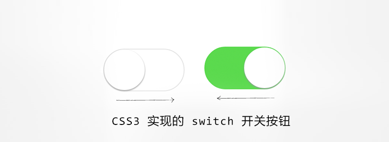
今天继续分享一个iOS风格的switch开关按钮,样子也非常常见,如图:
主要是使用了<input ?type="checkbox">来模拟实现,具体的HTML:
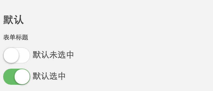
<label><input class="mui-switch" type="checkbox"> 默认未选中</label>
<label><input class="mui-switch" type="checkbox" checked> 默认选中</label>
<label><input class="mui-switch mui-switch-animbg" type="checkbox"> 默认未选中,简单的背景过渡效果,加mui-switch-animbg类即可</label>
<label><input class="mui-switch mui-switch-animbg" type="checkbox" checked> 默认选中</label>
<label><input class="mui-switch mui-switch-anim" type="checkbox"> 默认未选中,过渡效果,加 mui-switch-anim
类即可</label>
<label><input class="mui-switch mui-switch-anim" type="checkbox" checked> 默认选中</label>
在实际的使用中后来又增加了两个过渡效果,分别加?mui-switch-animbg和mui-switch-anim?类即可,具体效果查看下面的demo页面。
CSS代码(SCSS导出的,排版有些奇怪):
.mui-switch {
  width: 52px;
  height: 31px;
  position: relative;
  border: 1px solid #dfdfdf;
  background-color: #fdfdfd;
  box-shadow: #dfdfdf 0 0 0 0 inset;
  border-radius: 20px;
  border-top-left-radius: 20px;
  border-top-right-radius: 20px;
  border-bottom-left-radius: 20px;
  border-bottom-right-radius: 20px;
  background-clip: content-box;
  display: inline-block;
  -webkit-appearance: none;
  user-select: none;
  outline: none; }
  .mui-switch:before {
    content: '';
    width: 29px;
    height: 29px;
    position: absolute;
    top: 0px;
    left: 0;
    border-radius: 20px;
    border-top-left-radius: 20px;
    border-top-right-radius: 20px;
    border-bottom-left-radius: 20px;
    border-bottom-right-radius: 20px;
    background-color: #fff;
    box-shadow: 0 1px 3px rgba(0, 0, 0, 0.4); }
  .mui-switch:checked {
    border-color: #64bd63;
    box-shadow: #64bd63 0 0 0 16px inset;
    background-color: #64bd63; }
    .mui-switch:checked:before {
      left: 21px; }
  .mui-switch.mui-switch-animbg {
    transition: background-color ease 0.4s; }
    .mui-switch.mui-switch-animbg:before {
      transition: left 0.3s; }
    .mui-switch.mui-switch-animbg:checked {
      box-shadow: #dfdfdf 0 0 0 0 inset;
      background-color: #64bd63;
      transition: border-color 0.4s, background-color ease 0.4s; }
      .mui-switch.mui-switch-animbg:checked:before {
        transition: left 0.3s; }
  .mui-switch.mui-switch-anim {
    transition: border cubic-bezier(0, 0, 0, 1) 0.4s, box-shadow cubic-bezier(0, 0, 0, 1) 0.4s; }
    .mui-switch.mui-switch-anim:before {
      transition: left 0.3s; }
    .mui-switch.mui-switch-anim:checked {
      box-shadow: #64bd63 0 0 0 16px inset;
      background-color: #64bd63;
      transition: border ease 0.4s, box-shadow ease 0.4s, background-color ease 1.2s; }
      .mui-switch.mui-switch-anim:checked:before {
        transition: left 0.3s; }

/*# sourceMappingURL=mui-switch.css.map */
SCSS代码:
@mixin borderRadius($radius:20px) {
  border-radius: $radius;
  border-top-left-radius: $radius;
  border-top-right-radius: $radius;
  border-bottom-left-radius: $radius;
  border-bottom-right-radius: $radius;
}

$duration: .4s;
$checkedColor: #64bd63;
.mui-switch {
  width: 52px;
  height: 31px;
  position: relative;
  border: 1px solid #dfdfdf;
  background-color: #fdfdfd;
  box-shadow: #dfdfdf 0 0 0 0 inset;
  @include borderRadius();
  background-clip: content-box;
  display: inline-block;
  -webkit-appearance: none;
  user-select: none;
  outline: none;
  &:before {
    content: '';
    width: 29px;
    height: 29px;
    position: absolute;
    top: 0px;
    left: 0;
    @include borderRadius();
    background-color: #fff;
    box-shadow: 0 1px 3px rgba(0, 0, 0, 0.4);
  }
  &:checked {
    border-color: $checkedColor;
    box-shadow: $checkedColor 0 0 0 16px inset;
    background-color: $checkedColor;
    &:before {
      left: 21px;
    }
  }
  &.mui-switch-animbg {
    transition: background-color ease $duration;
    &:before {
      transition: left 0.3s;
    }
    &:checked {
      box-shadow: #dfdfdf 0 0 0 0 inset;
      background-color: $checkedColor;
      transition: border-color $duration, background-color ease $duration;
      &:before {
        transition: left 0.3s;
      }
    }

  }
  &.mui-switch-anim {
    transition: border cubic-bezier(0, 0, 0, 1) $duration, box-shadow cubic-bezier(0, 0, 0, 1) $duration;
    &:before {
      transition: left 0.3s;
    }
    &:checked {
      box-shadow: $checkedColor 0 0 0 16px inset;
      background-color: $checkedColor;
      transition: border ease $duration, box-shadow ease $duration, background-color ease $duration*3;
      &:before {
        transition: left 0.3s;
      }
    }

  }
}
发现问题欢迎微博上@,带上截图,机型,浏览器版本等,感激不尽!
demo页面:https://www.html.cn/b-mui/switch.html,
demo二维码扫一扫:

兼容更多PC浏览器的美化请查看:美化单选框 radio 、多选框 checkbox 和 switch开关按钮


 test 2周前 (12-26)说:
 龙 3周前 (12-22)说:
 leec 3周前 (12-19)说:
 yazaky 3周前 (12-17)说:
 zhou 4周前 (12-14)说:
 一了个头 4周前 (12-14)说:

好强大···
为什么我照着做的,确实一个点击选择的出现对号的button
不支持火狐
你好 在demo中 我的鼠标没有在按钮上,在按钮的周围点击也会触发按钮的动效
应该是和label有关,在label范围内点击都会有效
不兼容火狐浏览器
有兼容方案 https://www.html.cn/archives/9274